The project
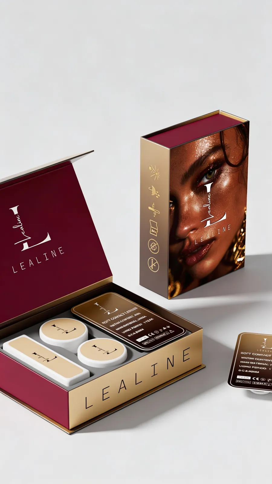
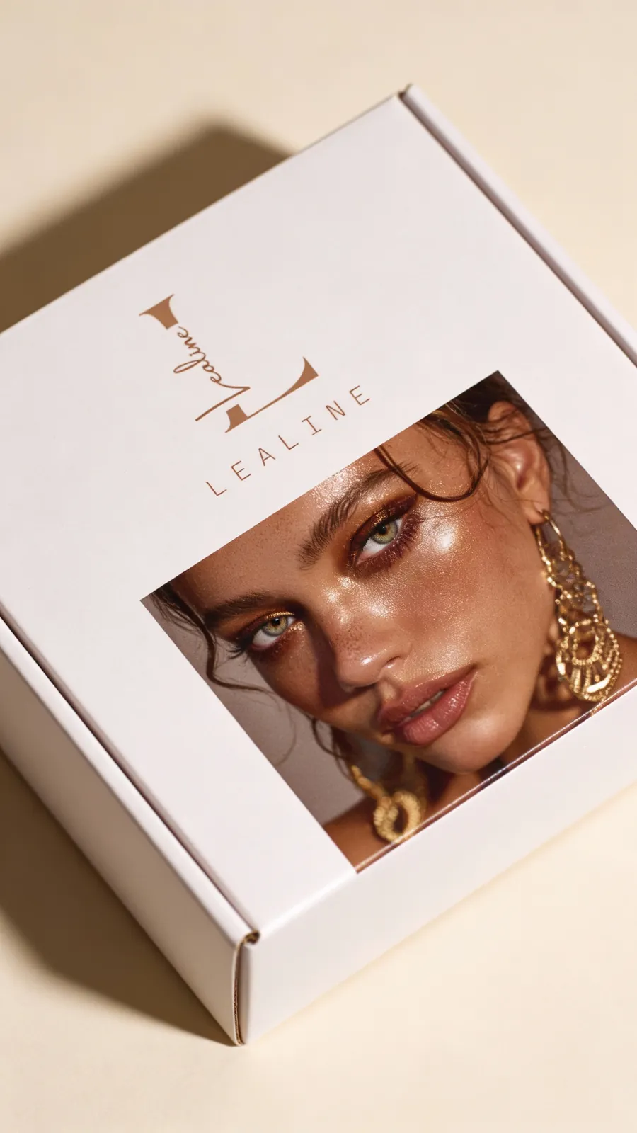
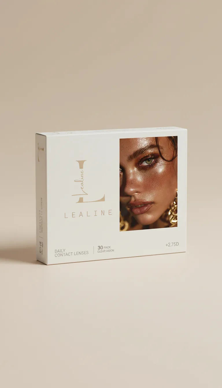
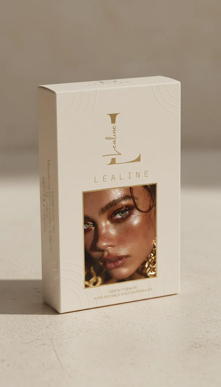
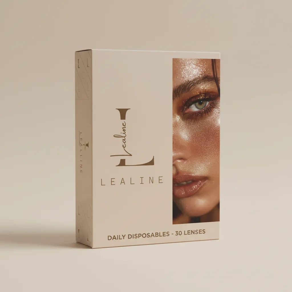
This is the brand redesign and packaging architecture for Glamela Cosmetics, the line led by LeaLine. The aim was to move the brand from a standard cosmetic label to a high-trust name in contact lenses: elegant, clean, and clearly luxurious.
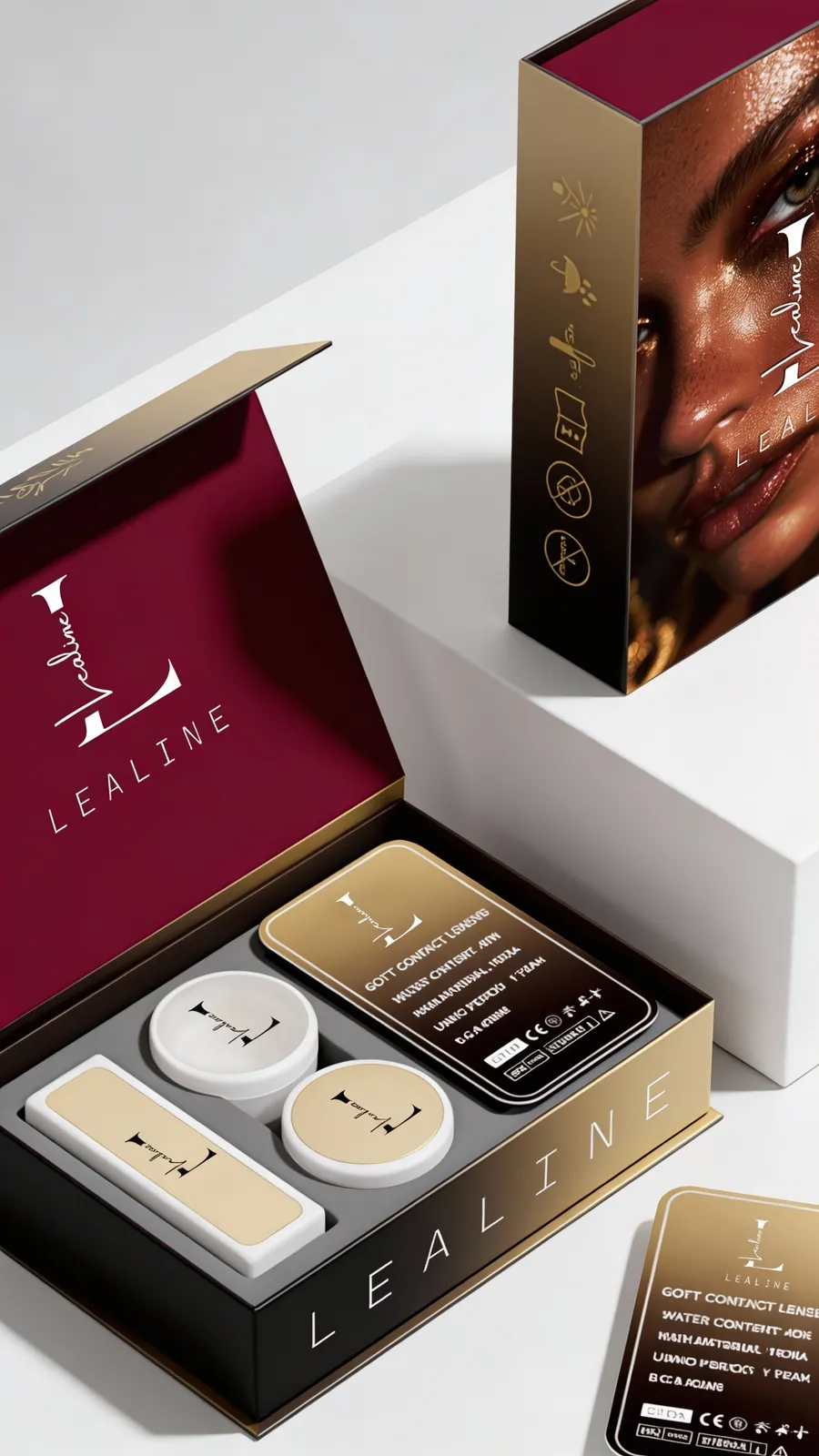
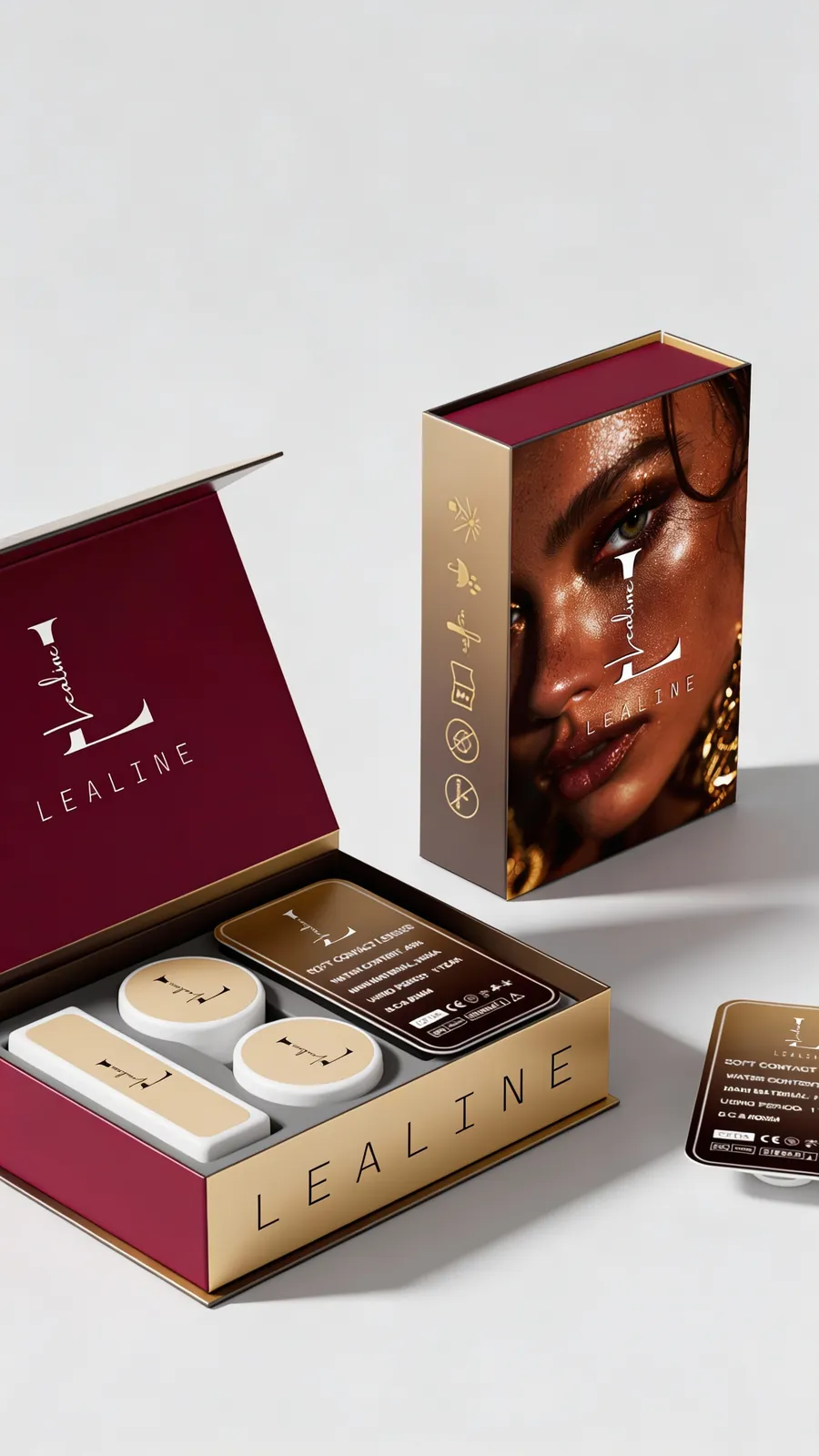
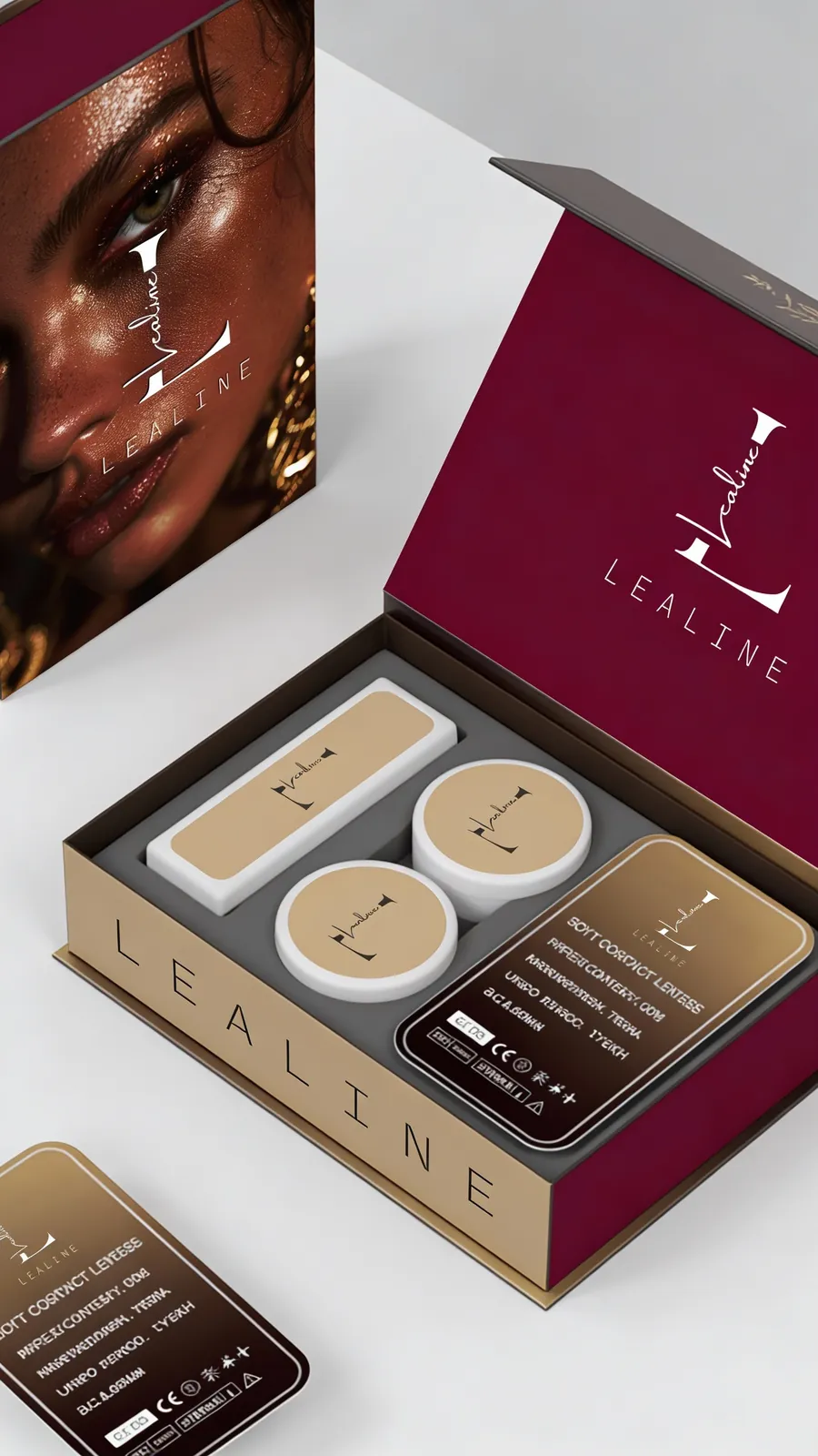
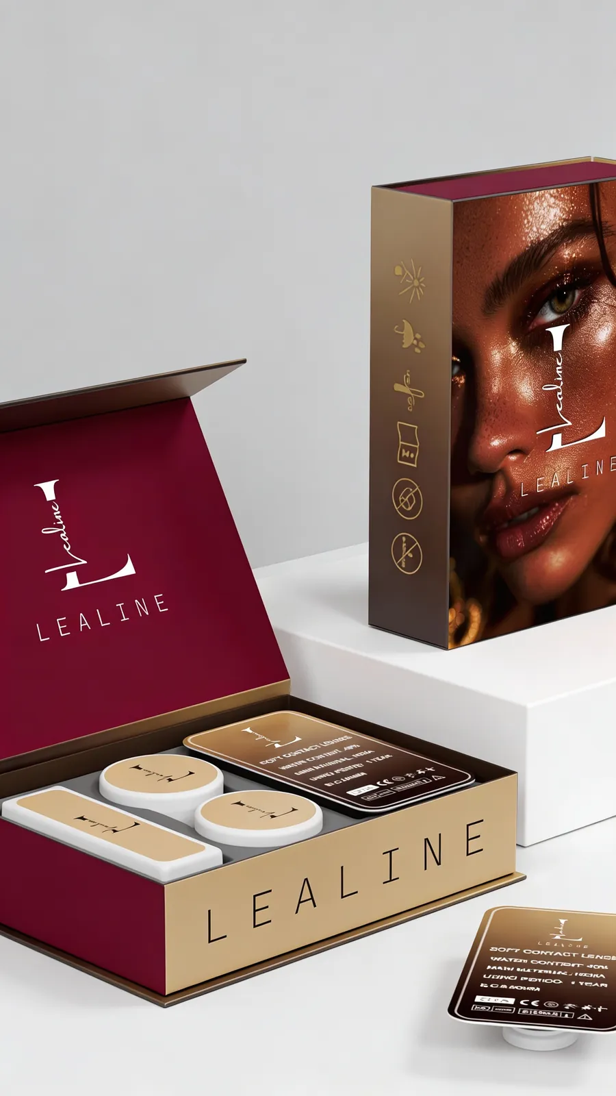
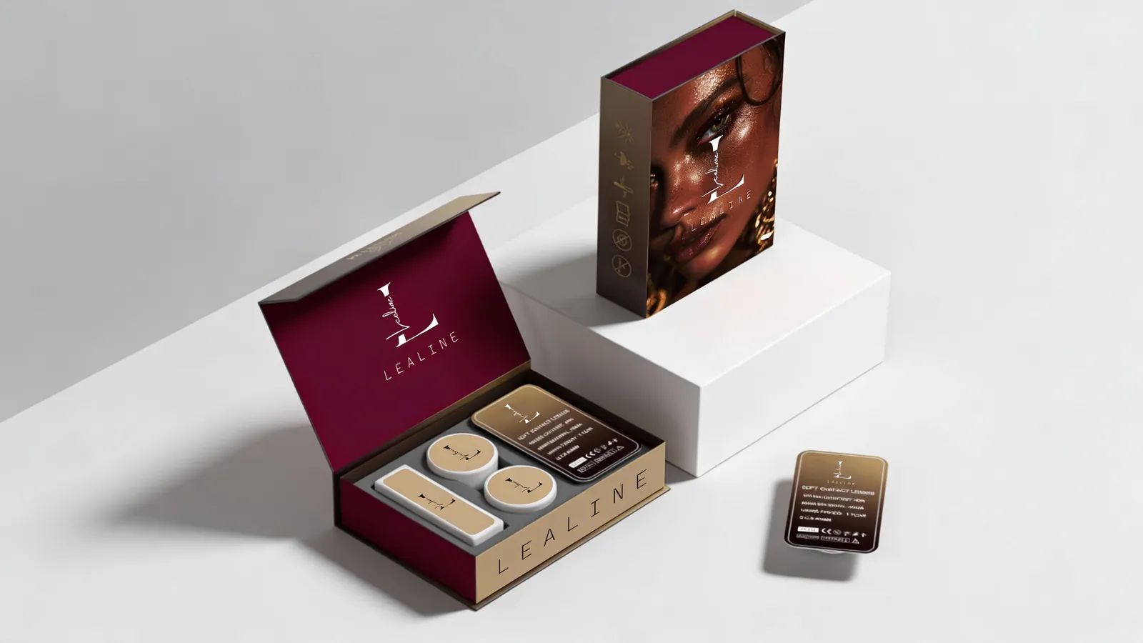
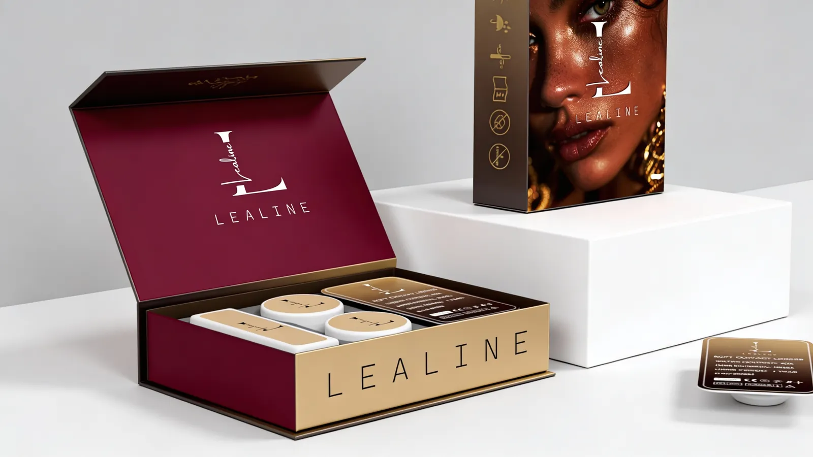
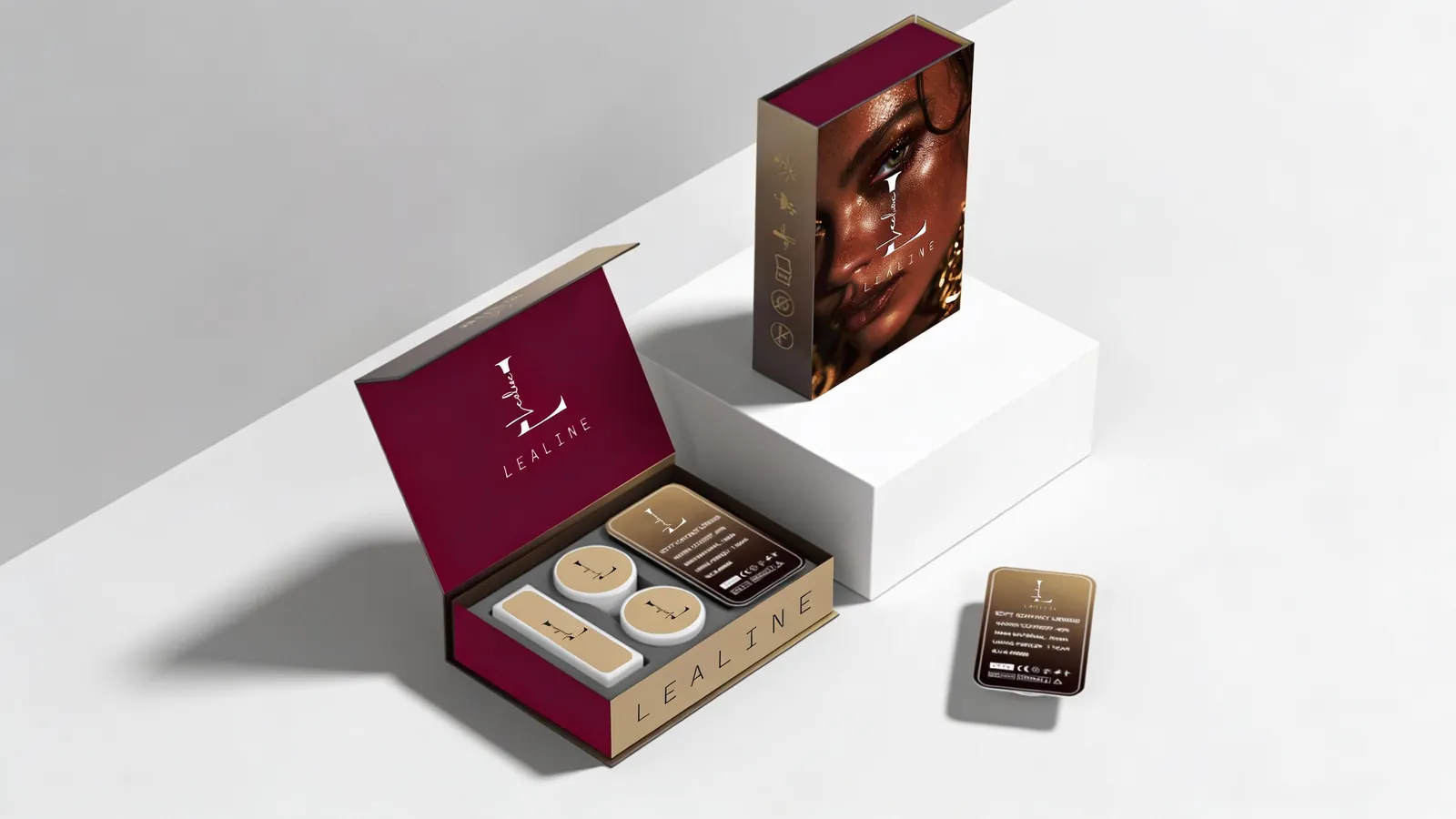
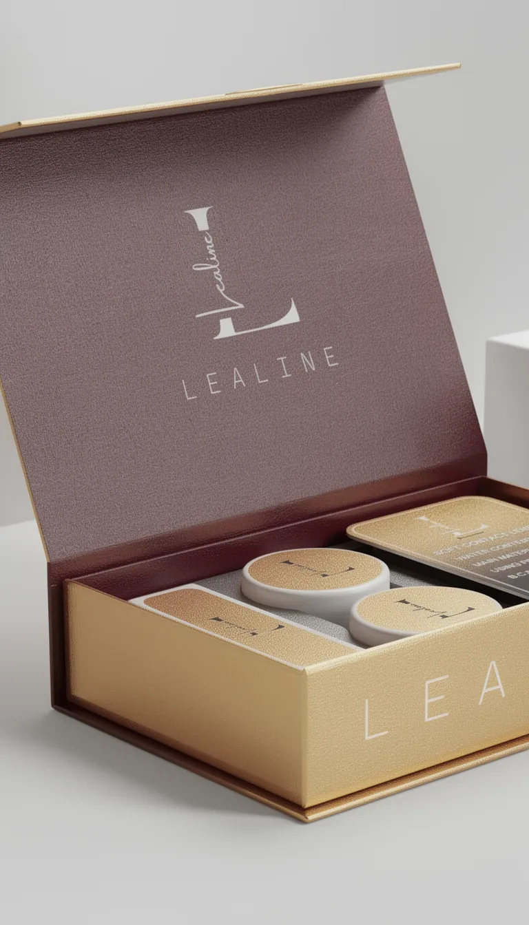
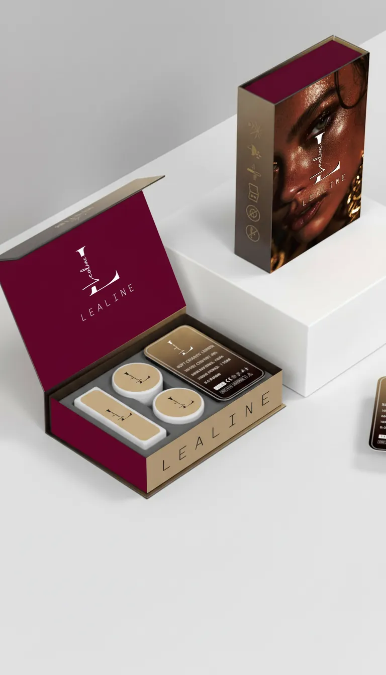
The work covered the identity system and a bespoke box for the signature lenses.
The challenge
The earlier identity did not hold together on a shelf or on a screen. The brand needed to say two things at once: safety and quality, which matter for something worn on the eye, and glamour, which is the point of the product. The lens box had to work as packaging and as an unboxing people would want to show.
Identity
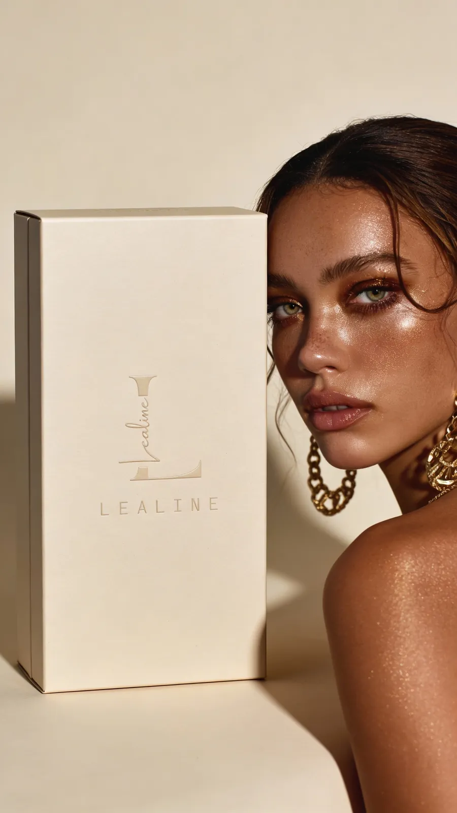
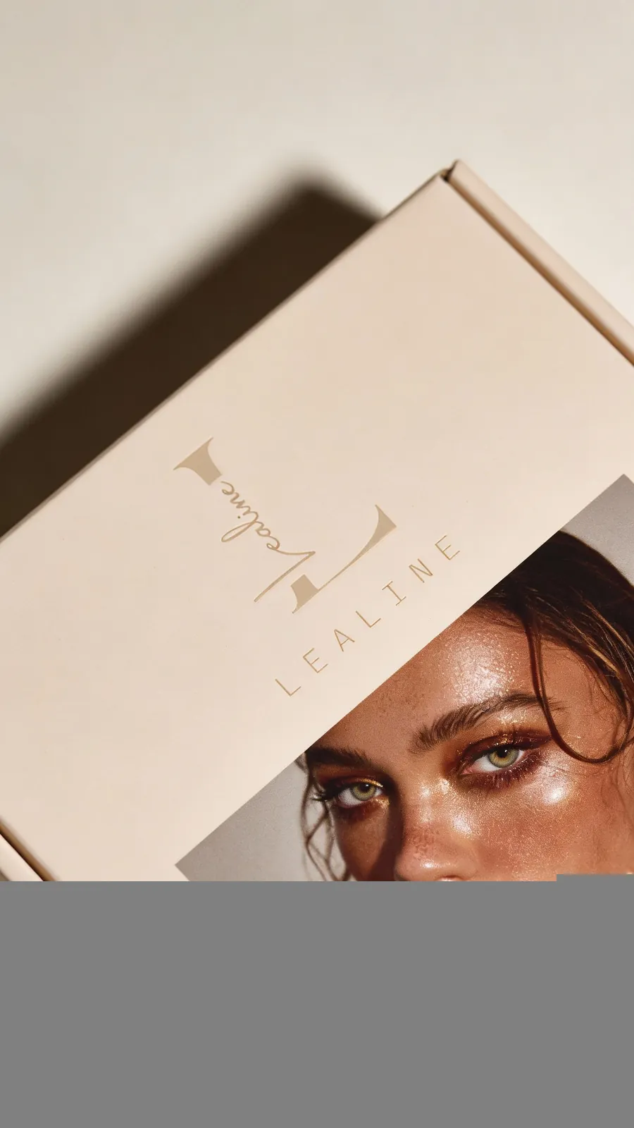
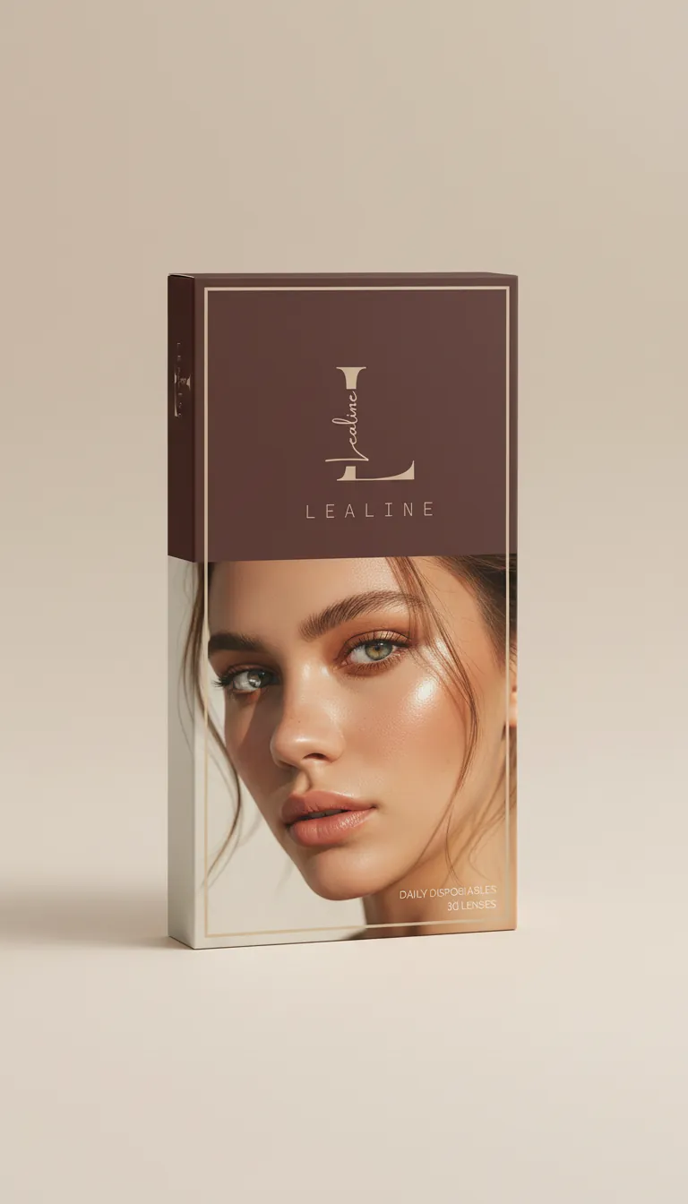
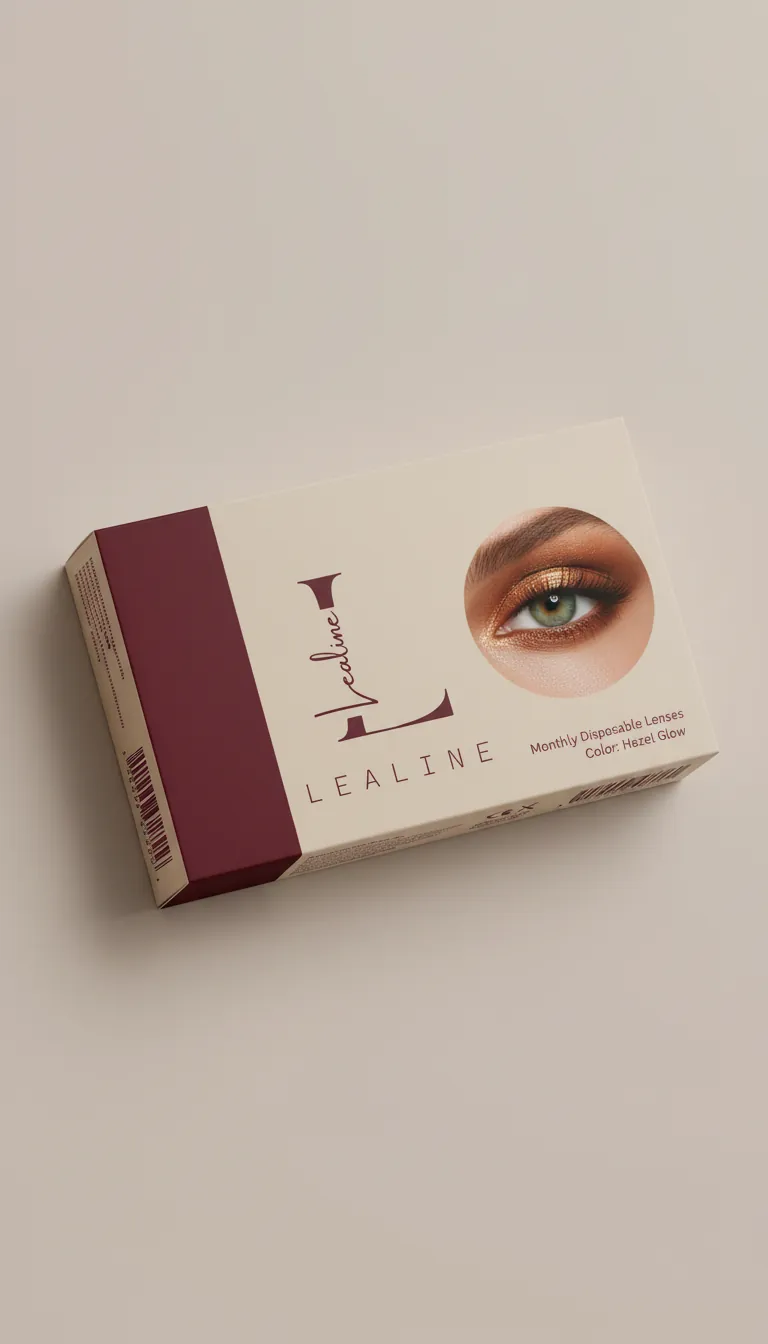
The logo is typographic and editorial. A serif carries the brand name; a plain sans is used where small type has to stay readable. The palette is soft nude, rose gold, and deep charcoal, so the line feels feminine and precise. Fluid shapes in the texture echo a lens and an iris.
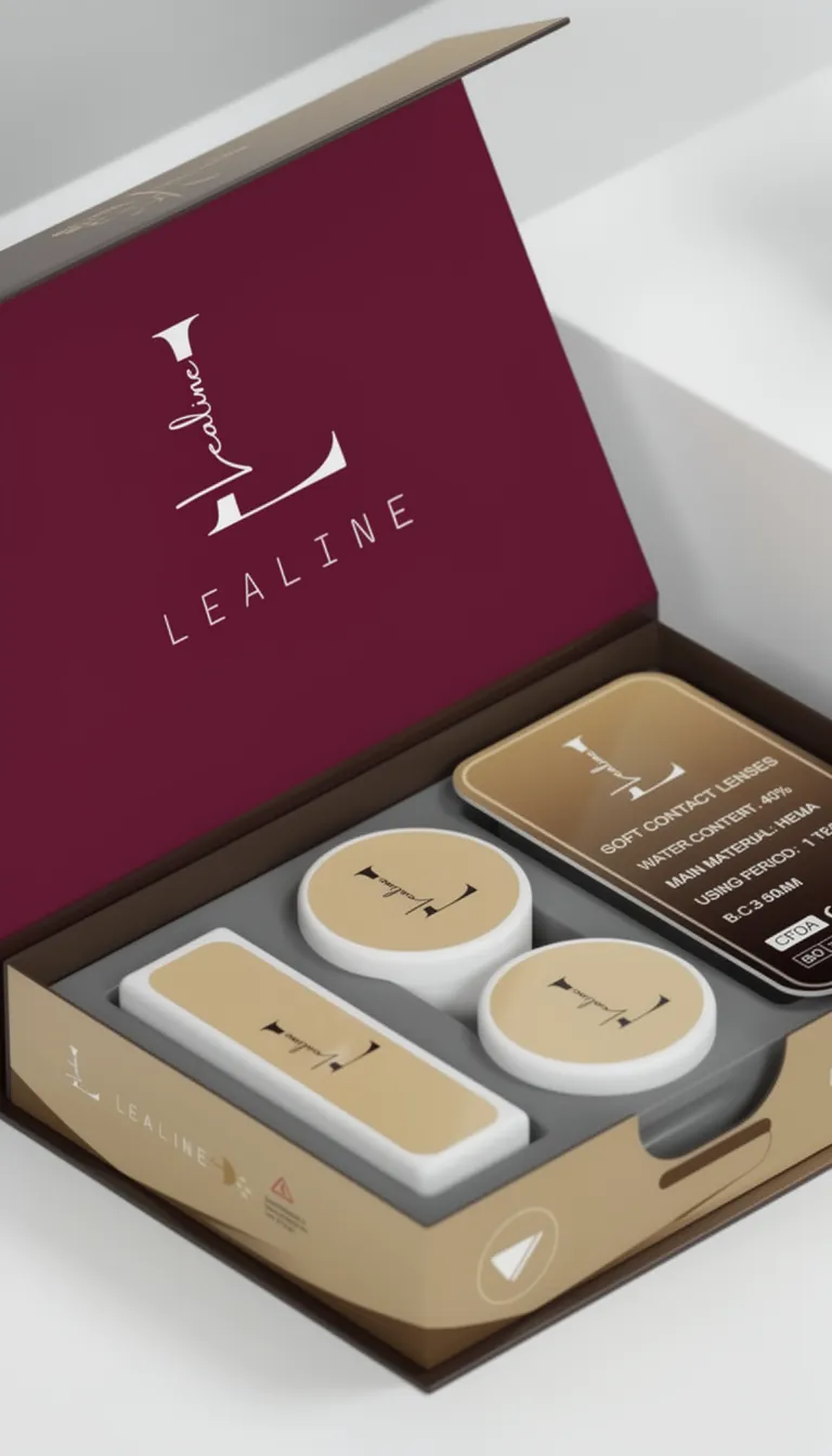
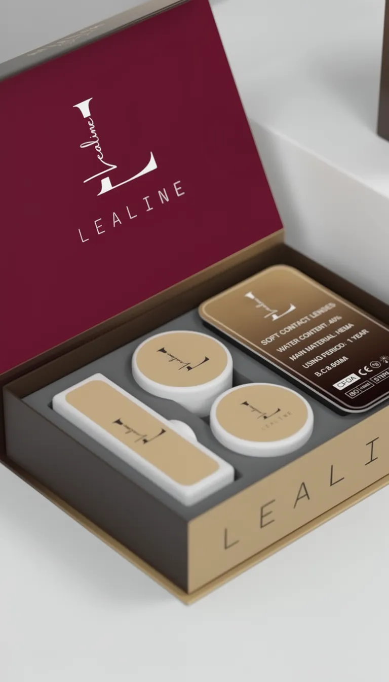
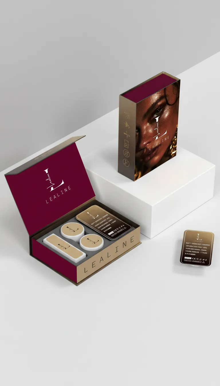
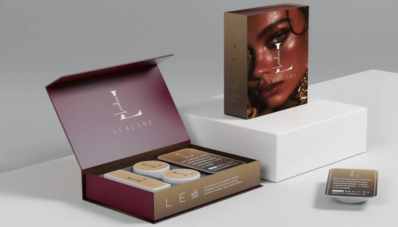
The lens box
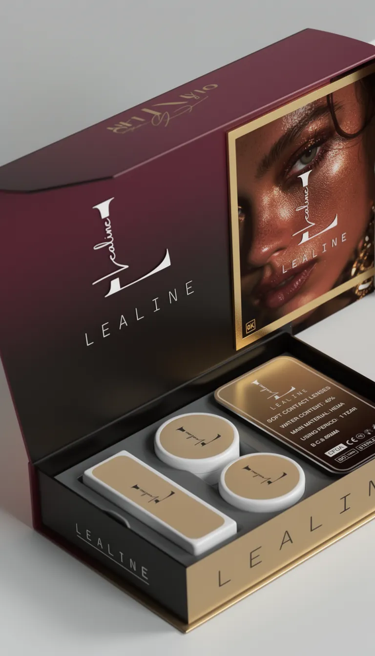
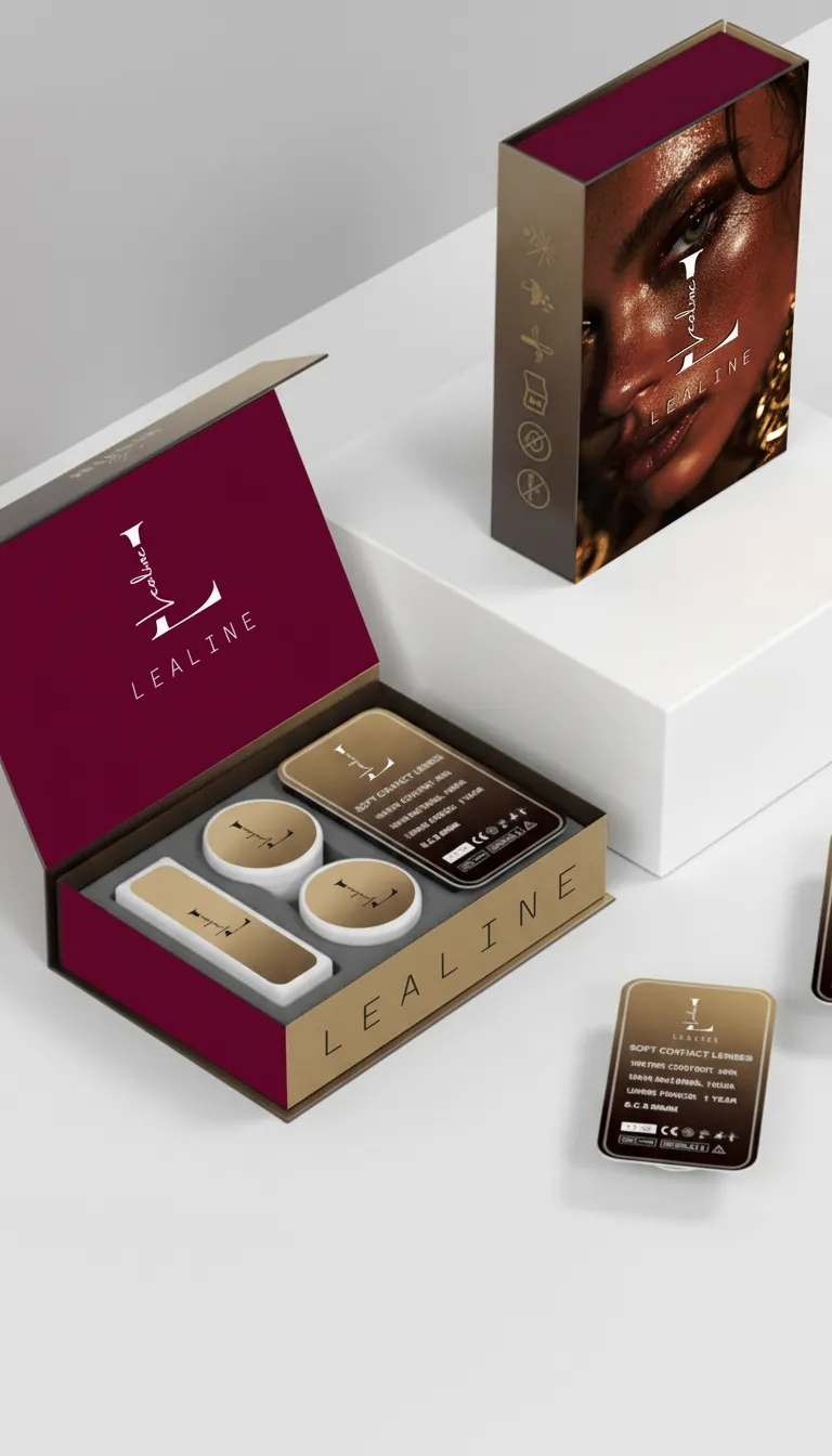
- A matte, soft-touch exterior with the mark in hot-foil stamp
- An interior tray that holds the vials still in transit and presents them when the box opens
- Medical details — diameter, base curve, power — set so they can be read at once without crowding the design
- LeaLine’s signature on the flap, a direct line from founder to customer
Outcome
The new box became part of how the brand is shared. Customers photograph the unboxing, and that photograph does the marketing.
Visuals
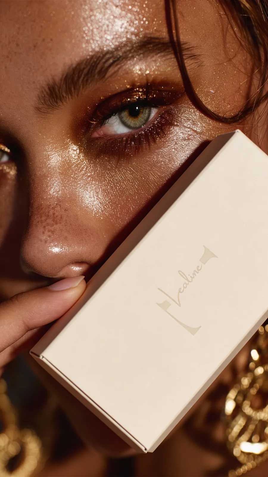
Photographs, packaging, and campaign pieces from this project.